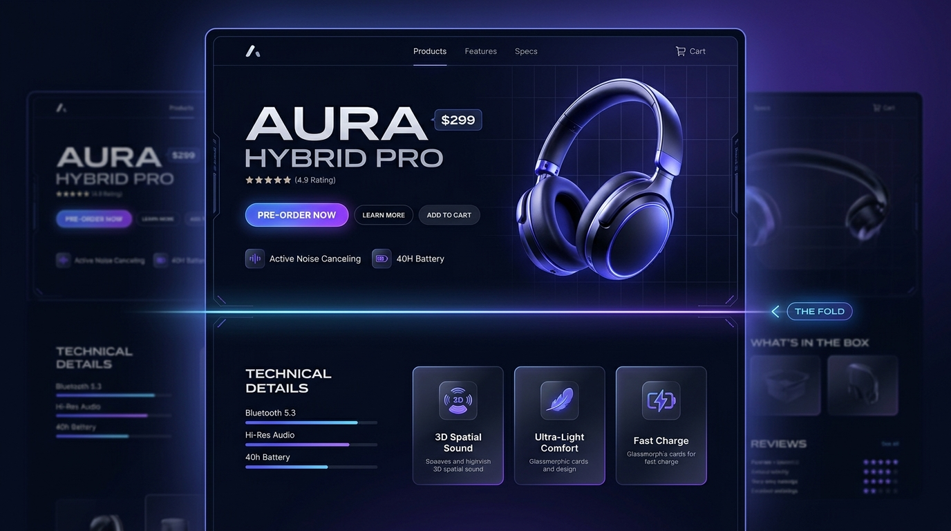
What Actually Needs to Be Above the Fold on a Shopify Product Page
Product image, price, the add-to-cart action, and any critical variant selector (size, color) that's required before purchase. If a customer has to scroll to find the price or the buy button, that's a real conversion cost.
Full description, detailed specs, and related products can live below the fold without costing conversions — customers who want that detail will scroll for it, and it doesn't need to compete for the first screen's attention.
Cramming trust badges, shipping info, and a review widget all above the fold alongside everything else creates visual noise that buries the actual buy action. Trust signals matter, but they can sit just below the fold without losing their effect.