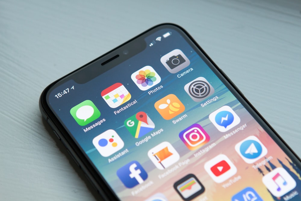
Why Mobile-First Design is No Longer Optional
Global statistics clearly show that over 60% of all web traffic now originates from mobile devices, a number that jumps significantly higher in B2C and e-commerce sectors. A desktop-first design mentality treats your largest audience segment as an afterthought. Mobile-first design flips this script, forcing designers to prioritize essential content and streamline navigation for small screens before scaling up for larger displays.
Google has fully transitioned to mobile-first indexing. This means that Google predominantly uses the mobile version of the content for indexing and ranking. If your mobile site lacks content, loads slowly, or has a poor UX compared to your desktop site, your search rankings will plummet. SEO success is inextricably linked to mobile performance.
Designing for a 6-inch screen forces clarity. It eliminates the luxury of sprawling layouts and forces brands to decide what truly matters. The constraints of mobile design—touch targets, concise copy, clear calls-to-action—result in a leaner, more focused user experience. When you scale this focused design up to a desktop, the result is often a much cleaner and more intuitive interface.
Mobile devices often operate on slower, less reliable networks than desktops connected to broadband. Mobile-first design intrinsically demands a performance-first mindset. Optimizing images, minifying code, and leveraging browser caching aren't just technical chores; they are essential design decisions that impact whether a user stays or leaves.
At KLYX, we begin every project with the mobile experience. We prototype touch interactions, thumb zones, and mobile navigation before we even look at a desktop viewport. This ensures that the majority of your users get a first-class experience, driving higher engagement and conversion rates.